 Sofie
Sofie
Defensive CSS: better safe than sorry
Every developer who has actually written CSS will certainly recognise the following situation: you create a layout or component that looks great at first glance, but as soon as you use it with different texts, images or screen widths, all kinds of things suddenly start going wrong. The image is squashed out, a piece of text appears to take up much more space than you had anticipated, an unwanted horizontal scroll bar appears on smaller screens, etc.
If you recognise this problem all too well, then this is the article you should be reading!
What is defensive CSS?
"Defensive CSS is a strategy for building future-proof components and layouts in CSS, solving problems before they happen. Most of the issues you anticipate with this have to do with dynamic content and responsiveness.
A few tips
1 — Take dynamic content into account
When you rebuild a design in CSS, you will often take over the content the designer initially created. This is useful in the beginning to produce an accurate copy of the design, but don't forget to also try out other texts that are a lot longer or shorter than what the design provides.
The same goes for images. Don't use the same placeholder images or exactly the same graphics as in the design. The layout you build should be prepared for images of any size.
In short: don't make too many assumptions about what form the content can take.
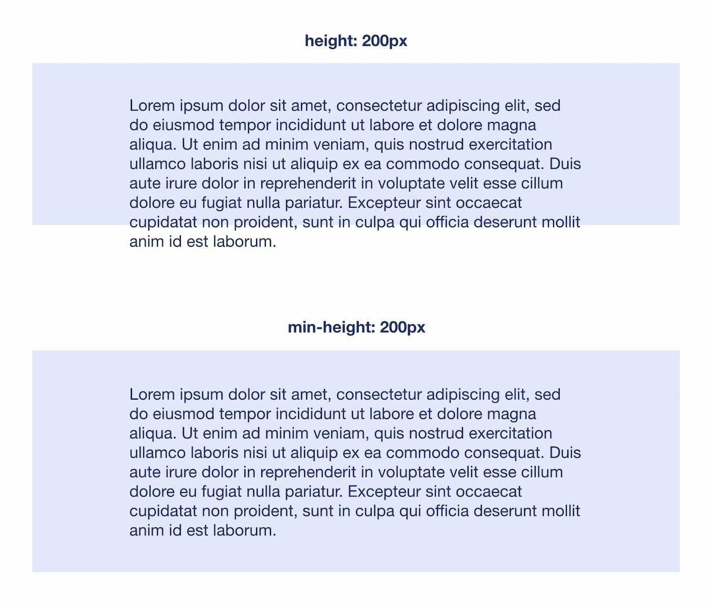
2 — Avoid fixed values
Suppose you create a banner component with a short piece of text and give it a fixed height. The customer asks you to use a different text, but the new text is a lot longer than the previous one, so it falls outside the limits of the banner.
However tempting it may be, it is rarely a good idea to use fixed values for elements that contain dynamic content. A component should take into account the size of its content, not the other way around.
3 - Always have a plan B
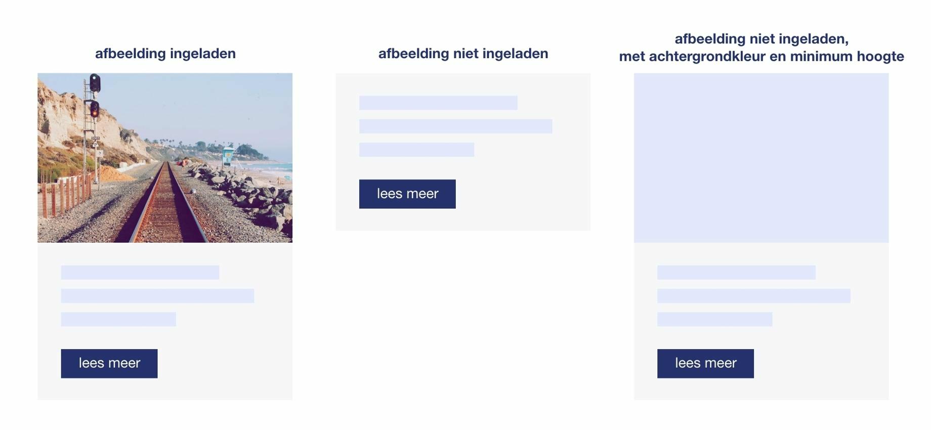
When a component or layout contains an image, it is not always guaranteed that this image will be available. This is already the case when, for instance, it has simply not been possible to load the image. The space normally occupied by the image will be lost, and the layout will no longer appear correct.
You can avoid this by giving the element of your image a minimum height. If you also add a background colour to the element, you will hardly notice any difference with a component of which the image has been loaded. This background colour is also useful for images that are available, but need some time to load. In this way you give the user a visual indication of where another image will appear.
4 - Learn from your mistakes
This goes without saying, but try to apply the solutions you found for certain problems consistently and preventively in new projects. If you notice that you keep making certain mistakes, give them some extra attention in your next projects or document them for yourself and your team. Prevention is the best cure!
Conclusion
If you remember one thing from this post, let it be this: take all the "what if" scenarios into account. What if this text turns out to be longer or shorter than what was in the design? What if I view this component on a smartphone screen? What if this image does not load? Some situations may seem unlikely, but that makes it extra painful when they do happen.
The concept of "defensive CSS" was introduced by UX designer and front-end developer Ahmad Shadeed. More information, tips and examples can be found on the corresponding website: www.defensivecss.dev.
